

top the lionfish rides the regal queen of the sea in this artwork by artist James C. Christensen (1942–2017). This design shows why Christensen’s art, inspired by myth, legend and fantasy, so dazzled his legions of fans. He was renowned not just for his pure imagination, but also for his embrace of curiosity and bravery.
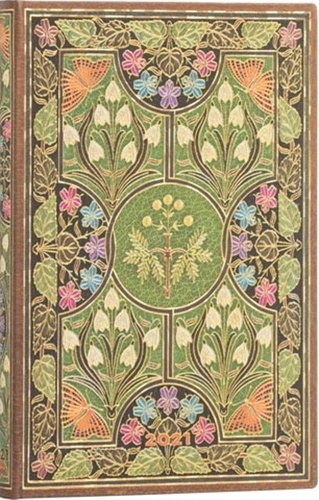
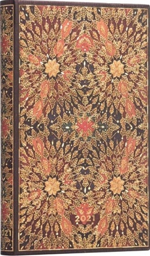
Inspired by a 17th-century Italian book binding, Oceania showcases a floral rosette motif. The original book contained a series of illustrations in the tondo form, a style of circular art. Once a popular artistic style in ancient Greece, tondo experienced a brief revitalization by Italian artists during the Renaissance.
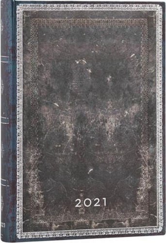
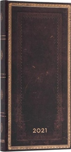
We have gone back to our publishing roots with our collection of Old Leather Classics, celebrating what it is about Renaissance-style gold tooled bindings that we have always found so captivating: the rich hues of the dyed leather. The timeless beauty of an antique leather binding is brought into the present on the cover of this deep blue book.

Laurel Burch was an American artist with an unmistakable style that was the physical manifestation of her love of life. From her fertile imagination she created vibrantly coloured and exquisitely embellished works of art, such as the painting reproduced on this journal cover.

This cover urges you to imagine yourself walking along the winding lanes that are home to the weavers of Varanasi, India. At one time there were as many as 300,000 weavers in the area, but today there are no more than 40,000. We have named it Gulabi after the Urdu word for “pink.”
This design comes from an 1893 binding housing Voltaire’s Zadig, or The Book of Fate. First published in 1747, it tells the story of Zadig, an ancient Babylonian philosopher. The book is a philosophical treatise that provides thematic inspiration for the modern detective story, including for Edgar Allan Poe’s C. Auguste Dupin.

“Maki-e” translates from Japanese to mean “sprinkled pictures,” a definition that perfectly captures the art form that has inspired this cover. Purchased from a private collector in Kyoto, the original maki-e lacquer box carrying this design dates back to either the Edo or Meiji period.
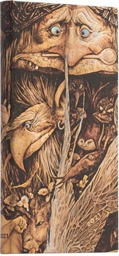
Brian Froud has drawn inspiration from the landscapes of the English moorlands to create an unparalleled body of creative work. He is the genius behind Jim Henson’s The Dark Crystal and Labyrinth. We have reproduced a scene from his 2007 book Brian Froud’s World of Faerie for our Mischievous Creatures cover design.
Tiptoe through the tulips with us as we discover Gary Grayson’s vibrantly detailed world in this cover design. Grayson’s distinctive style is an eclectic mix of vintage vector, impressionism and pop art – all combined in rich layers. May his boundless creativity so inspire your own imagination.
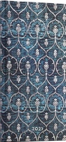
Our Blue Velvet design is inspired by a piece of a 15th-century velvet dalmatic. It is decorated in brocaded gilt metal thread with a seven-lobed shield, an artichoke-like botanical shape and tiny floral patterns.
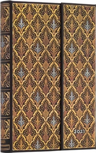
Morocco leather is a pliable material that has been valued in luxury book bindings since the late 16th century. Its strength provided a rich backdrop for showcasing embellishments, and it is this classic leather and gilt combination that has inspired us to create this cover.
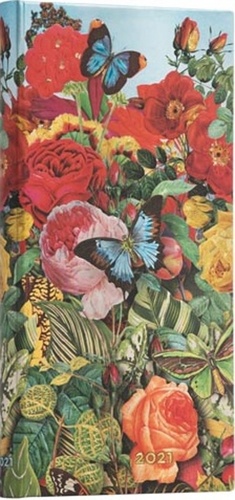
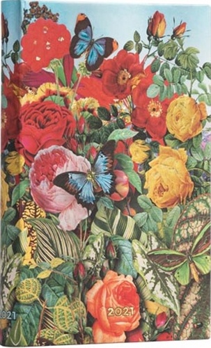
The design reproduced on this cover centres around a sensitive plant surrounded by other richly hued flowers, foliage and butterflies. The binding was used for The Sensitive Plant and Early Poems by Percy Bysshe Shelley and is a celebration of the creative spirit.
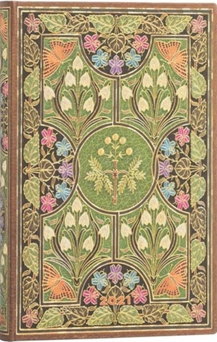
The design reproduced on this cover centres around a sensitive plant surrounded by other richly hued flowers, foliage and butterflies. The binding was used for The Sensitive Plant and Early Poems by Percy Bysshe Shelley and is a celebration of the creative spirit.
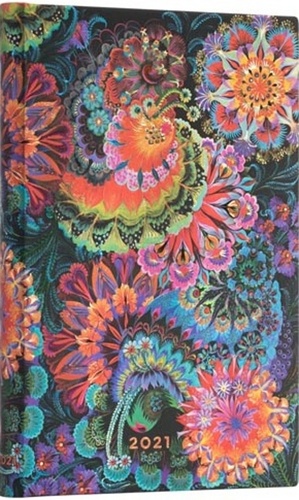
Olena Skytsiuk is one of the foremost practitioners of Ukrainian Petrykivka painting, a technique in which special brushes crafted from cat hairs create a visual effect unlike any other. In each design, like that reproduced on our Moonlight cover, thousands of small strokes combine to create colourful miniature scenes.
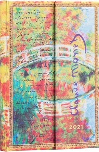
Upon moving to the French countryside, Claude Monet became entranced by the reflections his new pond created. Our Monet (Bridge) cover sets his pond-inspired 1895 oil painting Japanese Footbridge, Giverny against a letter he wrote to fellow Impressionist artist Berthe Morisot.
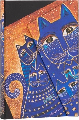
American artist Laurel Burch learned the craft of cloisonné while visiting China in 1971. She transformed this metalwork technique by creating colour compartments separated by gold and silver in her paintings, such as the one reproduced on this address book cover.
Tiptoe through the tulips with us as we discover Gary Grayson’s vibrantly detailed world in this cover design. Grayson’s distinctive style is an eclectic mix of vintage vector, impressionism and pop art – all combined in rich layers. May his boundless creativity so inspire your own imagination.
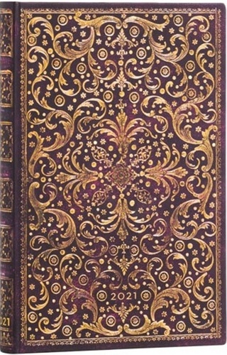
Brilliant fireworks are conjured up by this magnificent binding that originally covered La Déclamation Théâtrale (1766), a didactic poem by the prolific Claude J. Dorat. Though Dorat’s legacy is not that of a major master, one cannot help but admire his incandescent desire to create.
nside the original 1910 version of this sumptuous binding lay one of the oldest and most effortlessly romantic stories ever written: Daphnis and Chloe by the 2nd-century Greek author Longus. Our Chloe planner features a purple design, representing the character’s wisdom, dignity and mystery.
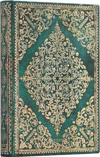
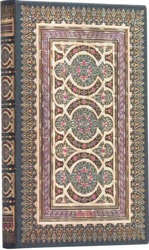
Our Aurelia design is fit for a king. Its inspiration dates back to Paris in the mid-18th century and the original binding housed copies of King Louis XV’s procedures for Holy Week. This book design is a marvellous riot of gold-tooled rococo elements, featuring birds, flowers and leaves.